Chart data structure
Create and populate charts through Documotor
Due to a large amount of data displayed in charts, the data has to be formatted in a specific way to allow chart insertion. The format is the same for both Word and PowerPoint - only the bindings differ. You can read about required format here, but you can also learn more about the chart bindings in Word and PowerPoint.
Data structure
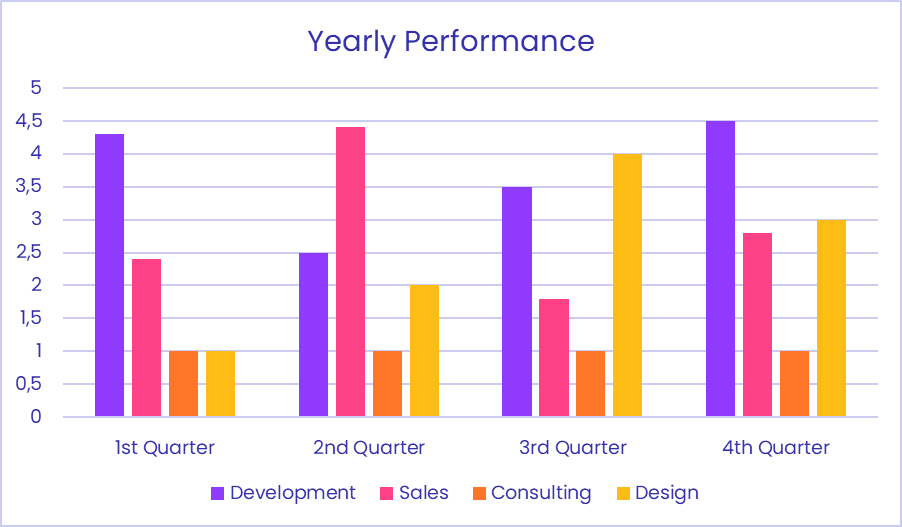
Here is an example of the data structure needed to insert a chart, and the chart that this data yields.
{
  "multiSeriesChart": {
    "title": "Yearly Performance",
    "categories": [
      "1st Quarter",
      "2nd Quarter",
      "3rd Quarter",
      "4th Quarter"
    ],
    "series": [
      {
        "name": "Development",
        "values": [
          4.3,
          2.5,
          3.5,
          4.5
        ]
      },
      {
        "name": "Sales",
        "values": [
          2.4,
          4.4,
          1.8,
          2.8
        ]
      },
      {
        "name": "Consulting",
        "values": [
          1,
          1,
          1,
          1
        ]
      },
      {
        "name": "Design",
        "values": [
          1,
          2,
          4,
          3
        ]
      }
    ]
  }
}
Let's analyze the data structure. For the standard multiseries graph shown here, our chart object multiSeriesChart had three properties:
title- the title of the chartcategories- the categories to be shown on the x-axis of the graph.series- the series of values that are displayed in the graph. Each series should have the same amount of data points as there are categories, so that there is a data point from each series in each category. If some of the series are shorter, the missing data will not be shown. Any missing data points can also be represented bynull.
If using a chart type that only supports one series, e.g., a pie chart, only the first series' data will be displayed.
Here is the chart yielded by the above data:
And a full overview of properties, their data types, and whether they are required:
| Name | Required | Type | Description |
|---|---|---|---|
title | optional | string | The chart title. |
categories | optional | array [ | The names of the categories of the chart. |
series | required | object | Contains the keys
,
, and
. |
The structure of the series object is as follows:
| Name | Required | Type | Description |
|---|---|---|---|
name | optional | string | The name of the series. |
values | required | array [ number | null ] | The values for the series. |
labels | optional | array [ string | number ] | The content of the data label. |
In PowerPoint, it's also possible to define axis titles for the charts that have axes. These are the parameters:
| Name | Required | Type | Description |
|---|---|---|---|
primaryCategoryAxisTitle | optional | string | Title of the primary category axis. |
primaryValueAxisTitle | optional | string | Title of the primary value axis. |
Template
When a chart is needed in the final output document, the template has to contain a chart. This chart will define the position of the chart in the generated document, the insertion of category labels and the colors used. Thus, the template chart must have category labels if you want the ones from your data to show up. You'll also have to define the color scheme if you want to use specific colors, either by setting the colors for each series, or by applying a color theme to the template. If your data has more series than the default chart and you're not using a theme, add the necessary series to the placeholder data in Word first, and then you'll be able to define the colors for all the series.
You can keep the default values of the title, values, category names and series, since the data from Documotor will overwrite those. However, if a property, e.g., the title, is not provided in the data, then the output chart will keep the title from the template chart.
The chart insertion is the same process in Word and in PowerPoint. The only difference between the two applications is in the bindings.
Bindings
In short, the binding format for standard charts in Word is { "BindingType": "Chart", "BindingKey": "ChartDataPath" }, while in PowerPoint, it's <<Chart:AltText$ChartData>>, where the chart data path points to an object with a format as described in the Data structure section. Visit the reference pages to read more about charts in Word and in PowerPoint.
ExtendedChart
Some of the more special chart types are covered by the ExtendedChart binding type. These are:
- box and whisker
- funnel
- sunburst
- treemap
- region map
- waterfall
The binding type is the only difference in the template setup. However, the data structure in your transformation needs to be adjusted to the specific chart. The following section is an overview of the required data structures.
Box and whisker
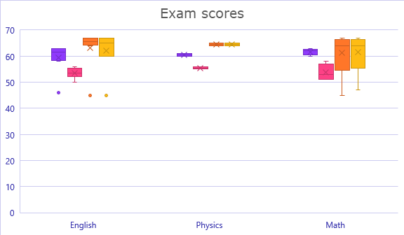
Here is an example of chart data for the box and whisker plot.
{
  "boxWhisker": {
    "title": "Box and whisker",
    "primaryCategoryAxisTitle": "Subjects",
    "primaryValueAxisTitle": "Score",
    "categories": [
      "English", "Physics", "English", "Math", "English", "English", "Math",
      "Math", "English", "English", "Physics", "English", "Math", "Math",
      "English"
    ],
    "series": [
      {
        "name": "School A",
        "values": [63, 61, 63, 62, 46, 58, 60, 62, 63, 63, 60, 60, 61, 63, 59]
      },
      {
        "name": "School B",
        "values": [53, 55, 50, 51, 53, 56, 51, 53, 54, 52, 56, 56, 56, 58, 54]
      },
      {
        "name": "School C",
        "values": [45, 65, 65, 64, 66, 67, 67, 66, 64, 67, 64, 67, 45, 64, 65]
      },
      {
        "name": "School D",
        "values": [45, 65, 65, 64, 60, 67, 67, 66, 60, 67, 64, 67, 47, 64, 65]
      }
    ]
  }
}
Notice that there is an equal number of categories and values in each of the four different series. The nth value in a values list belongs to the nth category in the categories list. Here is the chart produced by using this data in an ExtendedChart binding:
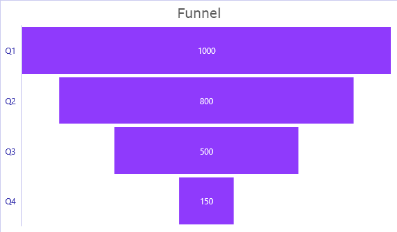
Funnel
The funnel chart uses the same data format as a single-series chart.
{
  "Funnel": {
    "title": "Funnel",
    "categories": [
      "Q1",
      "Q2",
      "Q3",
      "Q4"
    ],
    "series": [
      {
        "name": "First Series",
        "values": [
          1000,
          800,
          500,
          150
        ]
      }
    ]
  }
}
Here is the resulting funnel chart:
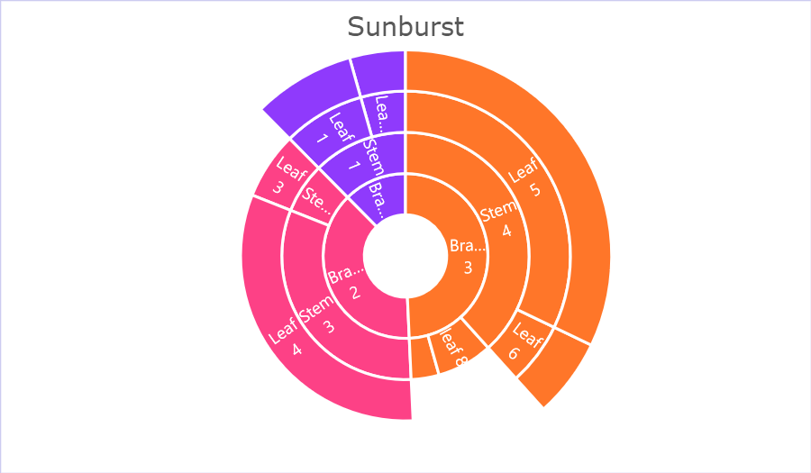
Sunburst
In a sunburst chart, the categories need to be defined on each level of the chart, from the center to the outermost part. This is done by defining an extendedCategories array of objects, where each object defines one layer with a name and a categories array. Here's an example:
{
  "Sunburst": {
    "title": "Sunburst",
    "extendedCategories": [
      {
        "name": "Layer 1",
        "categories": [
          "Branch 1",
          "Branch 1",
          "Branch 2",
          "Branch 2",
          "Branch 3",
          "Branch 3",
          "Branch 3",
          "Branch 3"
        ]
      },
      {
        "name": "Layer 2",
        "categories": [
          "Stem 1",
          "Stem 1",
          "Stem 2",
          "Stem 3",
          "Stem 4",
          "Stem 4",
          "leaf 7",
          "leaf 8"
        ]
      },
      {
        "name": "Layer 3",
        "categories": [
          "Leaf 1",
          "Leaf 2",
          "Leaf 3",
          "Leaf 4",
          "Leaf 5",
          "Leaf 6",
          "",
          ""
        ]
      },
      {
        "name": "Layer 4",
        "categories": [
          "End 1",
          "End 2",
          "",
          "",
          "End 5",
          "End 6",
          "",
          ""
        ]
      }
    ],
    "series": [
      {
        "name": "First Series",
        "values": [
          22,
          12,
          18,
          87,
          88,
          17,
          10,
          20
        ]
      }
    ]
  }
}
The resulting sunburst chart looks like this:
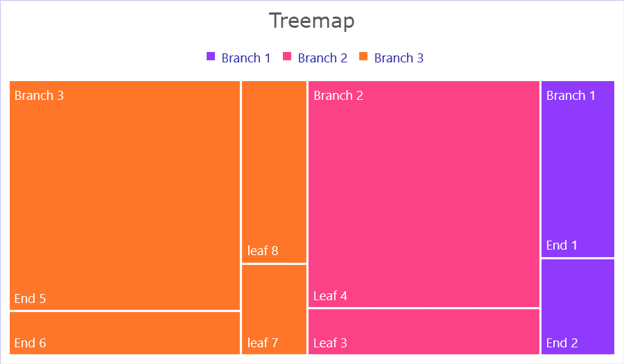
Treemap
The treemap chart requires the same input data format as the sunburst chart, since they divisions represent divisions data into sections. Here is the input data again, with only the key and the title changed:
{
  "Treemap": {
    "title": "Treemap",
    "extendedCategories": [
      {
        "name": "Layer 1",
        "categories": [
          "Branch 1",
          "Branch 1",
          "Branch 2",
          "Branch 2",
          "Branch 3",
          "Branch 3",
          "Branch 3",
          "Branch 3"
        ]
      },
      {
        "name": "Layer 2",
        "categories": [
          "Stem 1",
          "Stem 1",
          "Stem 2",
          "Stem 3",
          "Stem 4",
          "Stem 4",
          "leaf 7",
          "leaf 8"
        ]
      },
      {
        "name": "Layer 3",
        "categories": [
          "Leaf 1",
          "Leaf 2",
          "Leaf 3",
          "Leaf 4",
          "Leaf 5",
          "Leaf 6",
          "",
          ""
        ]
      },
      {
        "name": "Layer 4",
        "categories": [
          "End 1",
          "End 2",
          "",
          "",
          "End 5",
          "End 6",
          "",
          ""
        ]
      }
    ],
    "series": [
      {
        "name": "First Series",
        "values": [
          22,
          12,
          18,
          87,
          88,
          17,
          10,
          20
        ]
      }
    ]
  }
}
And here is the output chart:
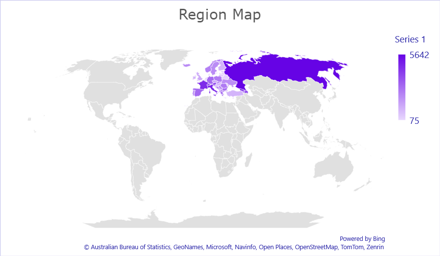
Region map
In the Region Map chart, the data also has the extendedCategories, but it is the categories must be geographical entities. Unlike in other charts, the same categories also need to be added to the data inside the template. The data provided is inserted into Microsoft 365, and Microsoft's search technology is used for finding entities referred to in the data. Therefore, the output is not completely deterministic, but depends on search performance. If one element is not found, the rest of the data might be impacted, so make sure all your data is easily searchable. The chart is a world map by default, but zooms in as needed depending on the provided data.
Here's an example of data that can be used to generate a region map:
{
	"RegionMap": {
    "title": "Region Map",
    "extendedCategories": [
      {
        "name": "State",
        "categories": [
          "Russia",
          "Georgia",
          "Italy",
          "France",
          "Switzerland",
          "Azerbaijan",
          "Armenia",
          "Austria",
          "Spain (Canary Islands)",
          "Denmark(Greenland)",
          "Spain",
          "Germany",
          "Andorra",
          "Bulgaria",
          "Greece",
          "Slovenia",
          "Albania",
          "North Macedonia",
          "Kosovo",
          "Slovakia",
          "Liechtenstein",
          "Romania",
          "Montenegro",
          "Poland",
          "Norway",
          "Bosnia and Herzegovina",
          "Portugal (Azores)",
          "Serbia",
          "Iceland",
          "Sweden",
          "Ukraine",
          "Portugal",
          "Cyprus",
          "Croatia",
          "Czechia",
          "United Kingdom",
          "Finland",
          "Ireland",
          "Turkey",
          "Hungary",
          "Netherlands (Saba)",
          "San Marino",
          "Belgium",
          "Luxembourg",
          "Moldova",
          "Belarus",
          "Netherlands",
          "Estonia",
          "Latvia",
          "Lithuania",
          "Malta",
          "Denmark",
          "Monaco",
          "Vatican City"
        ]


      }
    ],
    "series": [
      {
        "values": [
          5642,
          5193,
          4809,
          4634,
          4466,
          4090,
          3798,
          3718,
          3694,
          3482,
          2962,
          2942,
          2925,
          2917,
          2864,
          2764,
          2764,
          2658,
          2655,
          2599,
          2544,
          2534,
          2499,
          2469,
          2386,
          2351,
          2168,
          2110,
          2104,
          2061,
          1993,
          1952,
          1831,
          1603,
          1345,
          1324,
          1041,
          1031,
          1014,
          887,
          749,
          694,
          560,
          430,
          345,
          321,
          318,
          312,
          294,
          253,
          171,
          163,
          75
        ]
      }
    ]
  }

}
And here's the generated map:
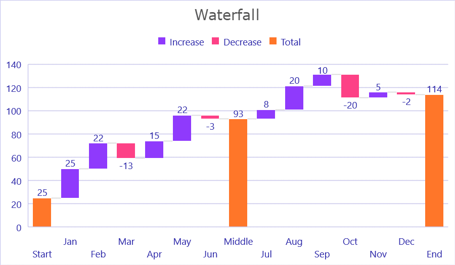
Waterfall
Below is an example of the data structure for a waterfall chart. Here we have an element called subtotals. The numbers defined here are the indices of where the chart should add a subtotal of the values. These indices match the index of the categories and values. So if the subtotal on index seven matches the category on index seven called “Middle” and value index “93,” which is also shown in the example output chart.
{
	"Waterfall": {
    "title": "Waterfall",
    "primaryCategoryAxisTitle": "Month",
    "primaryValueAxisTitle": "Monthly values",
    "categories": [
      "Start",
      "Jan",
      "Feb",
      "Mar",
      "Apr",
      "May",
      "Jun",
      "Middle",
      "Jul",
      "Aug",
      "Sep",
      "Oct",
      "Nov",
      "Dec",
      "End"
    ],
    "series": [
      {
        "name": "First Series",
        "values": [
          25,
          25,
          22,
          -13,
          15,
          22,
          -3,
          93,
          8,
          20,
          10,
          -20,
          5,
          -2,
          114
        ]
      }
    ],
    "subtotals": [
      0,
      7,
      14
    ]
}
}
And here is the output:
Updated about 1 year ago